The restaurant POS terminal market is worth $15.4 billion and expected to grow at a 6.4% CAGR between 2021 and 2028. However, an outdated focus on on-premise deployment has held the industry back. Most restaurant POS terminals don’t integrate artificial intelligence [AI] functionality and most are built on desktop-first designs. When designing a POS system for restaurants companies need to offer user-friendly software solutions packed with AI, cloud tech, mobile-first features, and impeccable UX / UI design, so that the industry agrees to pick up the check.
Consider these statistics about the current state of the industry:
- Nearly a quarter of mobile points of sale [mPOS] terminals are unable to accept payments.
- Security is still a risk for many POS systems. Data breaches revealed the information of 70 million Target customers and 56 million Home Depot customers.
- Only 15% of US-based businesses have AI-enabled POS systems.
- More than two thirds of the market still deploy on-premises solutions, even though those using cloud tech enjoy a higher speed of service and better customer satisfaction rates.
The advantages of the cloud tech, user-centered design, mobile payments, and AI allow owners to take both Table Service Restaurants [TSR] and Quick service [QSR] operations to a new level with positive impact on bottomline. Still, owners are in no rush to upgrade their software.
Subway, the US’s #1 QSR by number of outlets, is a strong example of how to make a custom POS system work for a brand. Its overarching focus was on simplicity. The company wanted to help associates interact with clients more during order taking and increase order entry rates. The POS development company fit the bill perfectly, so that many franchises found the software so easy to understand that they canceled formal training courses.
DevPro’s engineers have strong experience in the hospitality software development — our UX and UI engineers helped upgrade Lavu’s POS solution among other related projects. Here are some of our tips on counteracting pain points in the process as well as best practices of modern POS design for restaurants.
Typical UX Challenges When Designing a POS System
Front of House teams work under extreme pressure, especially during peak hours. Breakfast, lunch and dinner rushes are the constant that you cannot avoid, but the industry can take steps to mitigate its toll on service.
Clients will have hard-to-accommodate dietary requirements, kitchens will have bad days, waiters will keep forgetting guest requests and split checks will always be the nightmare of any server.
In the heat of a dinner service rush, associates need a tool to ease their job, not complicate it any further. This is why intuitive POS UX design is critical to a restaurant’s success. Here are a few of the challenges UX engineers need to mitigate.
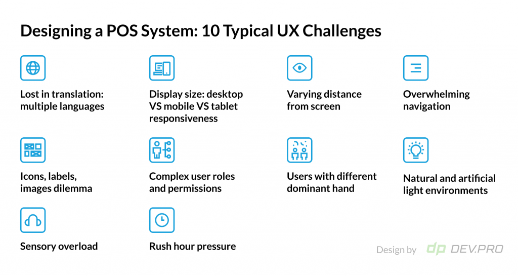
1. Designing a POS System in a Right Way: Account for Rush Hour Pressure
Not only are dinner service peak hours the busiest, they are also golden hours for making revenues, as this is a celebratory time when guests make spending decisions quickly.
Between 6PM and 9PM, restaurants often make two or three times as much per hour as they do during the rest of the day on average.
Rush hour pressure is why waiters and cashiers have trained themselves to tap twice as fast as the average user. This is another differentiating factor that defines the significance of integrity, intuitiveness and usability of point of sales design.
2. Display Size: Mobile and Tablet Responsiveness
It’s common for one outlet or chain of restaurants to use all available formats of POS systems simultaneously within a busy operation:
- Stationary desktop POS
- mPOS
- Tablet POS
- Self-service kiosks
Moreover, franchise chains may give a few options of display sizes for their partners to choose from to suit their budgets and other requirements. This is why every restaurant management system for front-of-house use should focus on making sure its software is mobile- and tablet-friendly.

3. Distance from Screen
Users view desktop POS systems from about 30 inches away. The comfortable range for viewing, however, is just twice as short.
As a result, engineers need to account for this distance when it comes to color-coding, icon design, font size, and the architecture of every screen.
4. Overwhelming Navigation
Menus may get extremely complex in fine-dining restaurants with side orders, “sauce on the side” requests, and dietary requirements adding additional complexity to an already broad menu assortment.
Given the time pressure faced by servers, the critical role of good UX becomes even more obvious.
The focus of usability specialists will be on making sure the design prioritises the most popular dishes first, the icons are clear, the hierarchy is logical, and all the menu wording is straightforward.
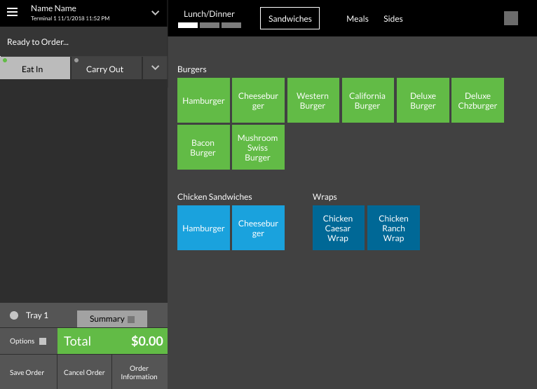
5. Icons, Labels, Images Dilemma
Graphic elements increase the speed of information processing — humans process pictures 60,000 times faster than text.
However, there are disadvantages to using different visual elements on the display of the POS system in restaurants:
- Images take space on the screen, reducing the amount of information that can be displayed
- Images take up memory space, which can negatively affect speed
- Image library needs to be constantly updated as products change
- Labels may be too small to function as a differentiating factor
- Similar products and dishes may look similar as an icon or image
These obstacles are all valid and each software development company tries to approach the icon and image issue from the user perspective.
6. Sensory Overload
Associates deal with so much sensory input during the service that they feel overloaded and struggle to perceive and process information.
This is why screens on POS terminals need to be as intuitive and clutter-free as possible.
7. Dominant Hand
Around 90% of humans are right-handed. However, UX and UI designers need to remember the 10% of left-handed people. This can be difficult because displays are often positioned on both sides of a counter.
8. Natural and Artificial Light Environments
Waiters working in outdoor areas may transition between darker indoor spaces and brighter outdoor spaces several times per hour. Brightness levels of the display play an important role in ease of use.
9. Lost in Translation: Multiple Languages
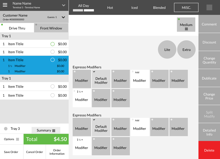
POS software needs to adapt to different languages. Consider the English and German words for ham (schinken in German). There are 266% more letters in the German version.
With examples like this, it is clear that language software adaptation is probably as critical as the mobile interface responsiveness. Each button should be readable and text fit the space allocated.
10. User Roles and Permissions: Critical When Designing a POS System
The organizational hierarchy in any restaurant adds more complexity to the POS design process. There is an array of team members with different sets of responsibilities and access levels: financial, analytical, provisional, operational, etc.
User roles and permissions need to be accounted for during the UI stage, whereby each team member gets access to just the functions they are authorized to have at the right point in service.
10 Best Practices of Designing a POS system for Restaurants That Is User-Friendly
DevPro Team has accumulated an expanse of know-how in the realm of restaurant POS design based on our collaboration with Lavu and other Food Tech software solutions.
These insights have proven efficient for our clients, their associates and customers.
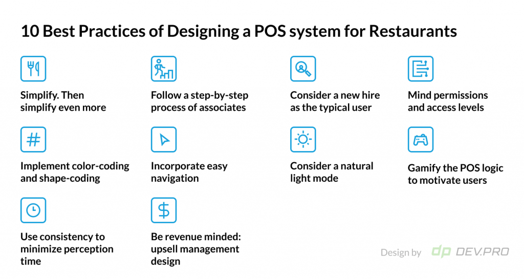
1. Simplify. Then Simplify Even More
Interfaces need to be intuitive, especially in high-stress environments like restaurants. Simplicity is at the core of intuitive design. Keep the screen basic and clutter-free at all times during the order-taking process as well as during payment.
2. Follow a Step-by-Step Process of Associates
There are many Standard Operating Procedures guiding a restaurant server or manager through the process of catering to a customer, including:
- Table reservation
- Greeting, seating and introduction
- Check and/or table opening
- Menu and daily specials familiarization
- Aperitif order taking
- Order taking and punching
- Special requests processment
- Order amendments and voids
- Out-of-stock items information
- Payment processing
- Split check / refunds / loyalty discount processing
- Receipt printing
Each process in this incomplete list of actions of a waiter is a multi-step consequence in itself with many variables. Let alone the multitude of roles in any restaurant operation, like the duties of a cashier, shift leader, purchasing manager, business development specialist, restaurant manager, etc.
For a restaurant POS system to be user-friendly, a UX/UI designer needs to follow each process, making sure its logic and variables are available when needed and not cluttered on the screen at the same time.
3. Consider a New Hire as the Typical User
Remember Subway’s custom restaurant POS that was so intuitive that managers skipped formal trainings?
It’s always good to design with the servers in mind. Even better: design for a user who is a total newcomer to the restaurant. This will help you create a system that guides the users instead of confusing them.
As a result, training times are reduced and onboarding is easier.
4. Use Consistency to Minimize Perception Time When Designing a POS System
In working environments as fast-paced as the food and catering industry, consistency of design offers a soothing background that helps the brain process only the most important stimuli.
Similar outlays, arrows, buttons, and identical navigation elements lower the cognitive load required to interpret the interface and make the UI easier to use.
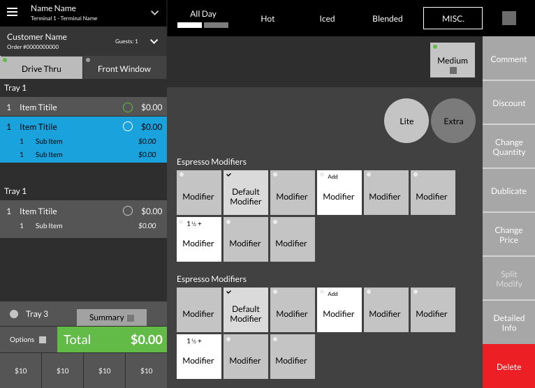
5. Implement Color-Coding and Shape-Coding
Color coding may serve as a minor distraction during initial interactions with the software. But as users get used to the software, it can help expedite cognitive processes, working as an extra signal and differentiator.
For example, let’s say you use a light pink hue for dessert buttons. When the server looks at the table order before printing a receipt, it could be easier to spot a missing dessert.
Pastel hues with high transparency are unobtrusive yet efficient. You can use green for salads and vegetarian options, red for meat dishes, etc.
Shapes are also useful differentiators, but not every shape is equally useful. A combination of squares and rectangles can help create a visual hierarchy, while triangles and circles aren’t helpful visual tools.
6. Incorporate Easy Navigation: How to Design a Restaurant POS Screen
The average adult spends two and a half hours every day consuming social media. Consider analyzing the navigation on popular networks like Facebook and LinkedIn when designing your POS display design.
Need to remind servers of out-of-stock items before the shift starts? Those small red notification icons – just like on Instagram – can help drive the user to check them. Have an urgent team-wide update in the middle of the service in a TSR with 200 covers, that needs to go out as soon as possible? Same notification icon can be used.
7. Be Revenue Minded: Upsell Management Module Design
Revenue management capabilities on a POS are not a core module for your average restaurant management software system. But revenue and upsell management is critical for the prosperity of many franchise and chain restaurants: as those extra cents in the average check go straight to the bottom-line.
In these situations, AI can be useful in driving sales based on historical analytics. Summertime and hot weather are just the right season to offer an iced drink, while the presence of kids or shifts on the weekends might lead to higher ice cream consumption. Coffee suggestions might get a higher acceptance rate in the mornings.
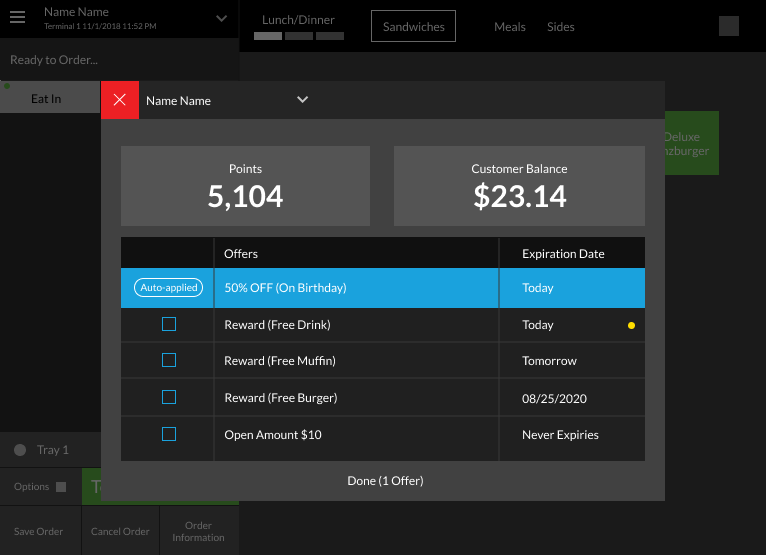
8. Gamify the POS Logic to Motivate Users
This is not your run-of-the-mill technical advice, while this may well be the future of restaurant POS whose main user is going to be the Gen Z server soon.
Digital natives are not only wired to navigate digital systems, they are also rather addicted to digital entertainment. Those restaurant POS software development companies that pioneer such features are likely to get an ROI in the shape of a strong upsurge in average check.
A simple thumbs up emoji or a disappearing “well-done” message popup when a client accepts an upsell can lead to strong positive reinforcement in the mind of an associate. Moreover, a user can check the ranking table at the end of the shift and accumulate badges.
9. Mind Permissions and Access Levels
A manager may have access to all of the functions of a server, but not vice versa. A cashier needs more accounting features than a server. Treating every role as a separate workflow unit is a good starting point to provide the architecture and features needed in each case.
10. Consider a Natural Light Mode
A lighter screen is easier to read in natural daylight. A good UX will allow users to easily toggle between lighter and darker screens. This is specifically critical when designing a POS system for international food operators who have outlets in hotter climes with outside seating.
POS System Design: The Future is Fun and Mobile
With AI, cloud tech, gamification, and mobile-first design slowly making their way into this legacy-ridden domain, many successful examples of custom made POS serve as a guiding beacon.
It’s the only software team members can use on long shifts, so new features and a future-focused approach is critical in designing these interfaces.
Meanwhile, the industry is trying to switch to cloud and make its software more mobile-friendly to start with and prove its ROI.
Dev.Pro has the expertise and vision to create a point of sale system for your restaurant chain based on the particular characteristics of your concept, turnover, menu, location, and budget. Let’s discuss how we can help make your restaurant management software part of your company’s business development strategy.
